

This is current view above my kitchen cabinets. There are lots of things that I would change about my kitchen if money was no problem. I feel like I can improve this look fairly easily though. Here are some things I notice about it.
* I really like the green butterfly that is in the center. It makes me happy.
*I just created the other butterfly. It has buttons. I like that it is also green but I thought it would match better.
*The shelf is actually very narrow, which makes it hard to find things that fit.
*My husband collects frogs.
*He is against putting nailholes to hang anything though.
*My mom painted the birdhouse and I think it is pretty.
*My daughter likes looking at and talking about all the different objects.
*The red bird doesn't match anything else. Neither does my Strawberry Shortcake lunchbox.
So I looked on Pinterest for some ideas and found contradictory advice. Some places said to keep everything the same color while other places said to use a variety. Haha. Well I guess I will try different things and see what I like.
Here are some Pinterest inspiration ideas:
 |
| Source |
I like the different shapes of the vases/ pictures. I also like how the globe creates a focal point.
 |
| Source |
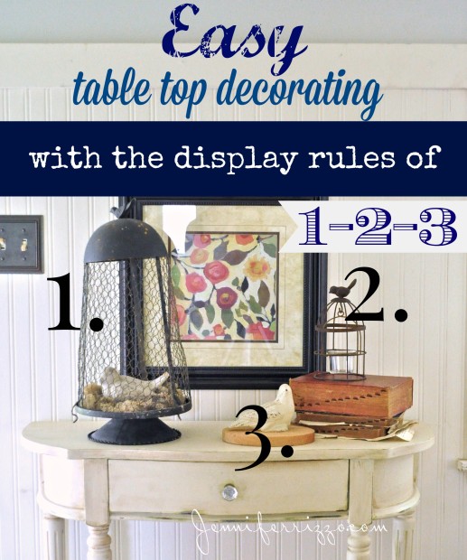
I like the "stacked" look. Maybe I could incorporate some pictures? I really like this article also. It talks about creating a horizontal band of color. I think maybe that's what I am going for with the repeats of green. Maybe I need to be more intentional about it and more of a solid band.
 |
| Source |
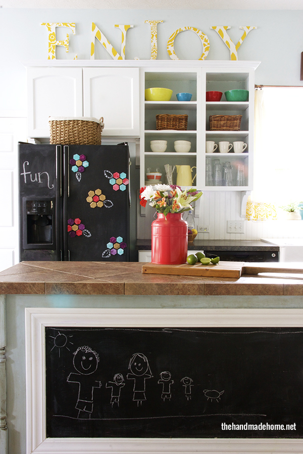
Okay, this fun, whimsical look is my style! What about a large printed word above my cabinets?
 |
| Source |
What do you think? What should be above my cabinets?

Update: Here is what I did to this space!
I like the vases/pitchers in the same color or the word the best.
ReplyDeleteHappy decorating!
Tonya
Storybook Endings in Second
Yeah, I think I do too. Plus, I don't have a million pictures laying around so that would get expensive!
ReplyDeleteThanks for linking up! I would put teapots and coffee pots, or maybe antique kitchen stuff? This is why my blog is called not very fancy. The word enjoy is cool, but is there really a person with a kitchen that looks like that? If so, is it because they eat out every night? I hope you link up again when you complete your project!
ReplyDeleteDeb
Not very fancy in 1st
My mom collects teapots and antique kitchen stuff-- that is definitely what she would put up there. What seems unrealistic about the ENJOY kitchen? The fact that all their coffee cups are facing the same direction? Or that the chalkboard has a nice, neat drawing instead of scribbles?
DeleteI'd add a variety of thing I like in the color scheme I like, but I'd probably get them from garage sales...that's where I find some of my best decorative items...especially when I know they'll just get dusty up there ;)
ReplyDeleteI agree! I have been searching for cheap decorations!
ReplyDelete